The starting point
Paquita Pilates is a boutique studio in Stuttgart-Ost for Reformer and Classical Pilates. The offering includes private sessions, duo training and small groups. The studio work was of a high standard. What was missing was a coherent brand, a professional website and a digital booking system. Appointments were managed by hand, which created extra work for clients and trainers.
The task was to translate the calm, body-aware character of the studio into brand and website. The aim was to reach the right people and to simplify how the studio is run.
Aims
Brand and digital infrastructure were built from the ground up.
• Brand: logo, colour world and visual language, used consistently on the website and other materials.
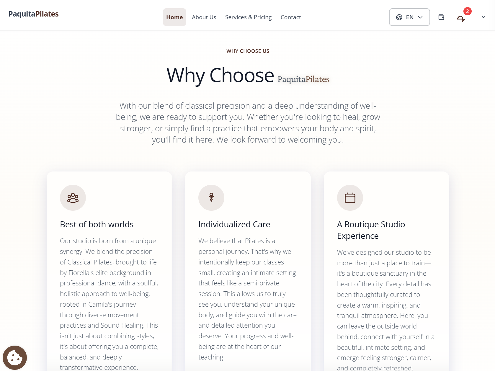
• Website: a presence that makes the studio's approach, class offering and team easy to understand.
• Booking system: a platform through which clients can book sessions themselves and trainers can manage the schedule.
• The website is available at paquitapilatesreformer.com.
Scope of work
The work was organised in three parts. • Brand and design system: logo, type and colour palette. The elements can be used digitally on the website and Instagram, and in print. • Website: a custom-built site as the main public presence. Calm layouts, clear spacing and unambiguous calls to action. The layout is designed for phone and desktop. • Booking system: an interface for clients to book and view the class schedule, and an administration area for trainers, classes and capacity.
Design
The visual system connects two sides of the studio: the physical and grounded with calm and attention.
The logo shows a central eye as a sign of awareness, with wings and ornamental detail in soft forms. The line "RETURN TO LIFE" refers to the original name of Joseph Pilates' method.
Type:
• Metanoia for headlines: a high-contrast serif. The name refers to a profound inner change and matches the studio's approach.
• Poppins for body text and the interface: a geometric sans-serif with good readability.
Colour palette of seven colours:
The colours take up the materials, light and stillness of the studio.
Technology
• Interface: Vue.js and Ionic, usable across devices
• Server: a custom interface with Node.js and MongoDB
• Live class schedule: availability and confirmation without delay
• Credits: a flexible prepaid model for clients
Outcome and next steps
Brand and website have been published. The booking system is currently being finished and introduced in stages.
Planned additions:
• Automatic waiting list
• Credit and package systems
• Class reminders
Our work covers brand, user flow, interface and the technical implementation. The booking should feel like the studio, not like generic software.
Screens
Highlights
Designed for phones
Clear navigation
Straightforward booking
Own technology